Typography is our system of fonts. Each font conveys the appropriate sentiment to assist our users through each stage of their journey.
Fonts
Brand typography
We use various styles of our two main fonts Hartwell Alt and Gotham Rounded, for almost everything brand and marketing — from digital banner ads to billboards. These fonts were chosen to be incredibly versatile with lots of range in terms of tone and playfulness. They can be used to portray our fun and expressive side as well as neutral when the situation calls for something a bit more serious.
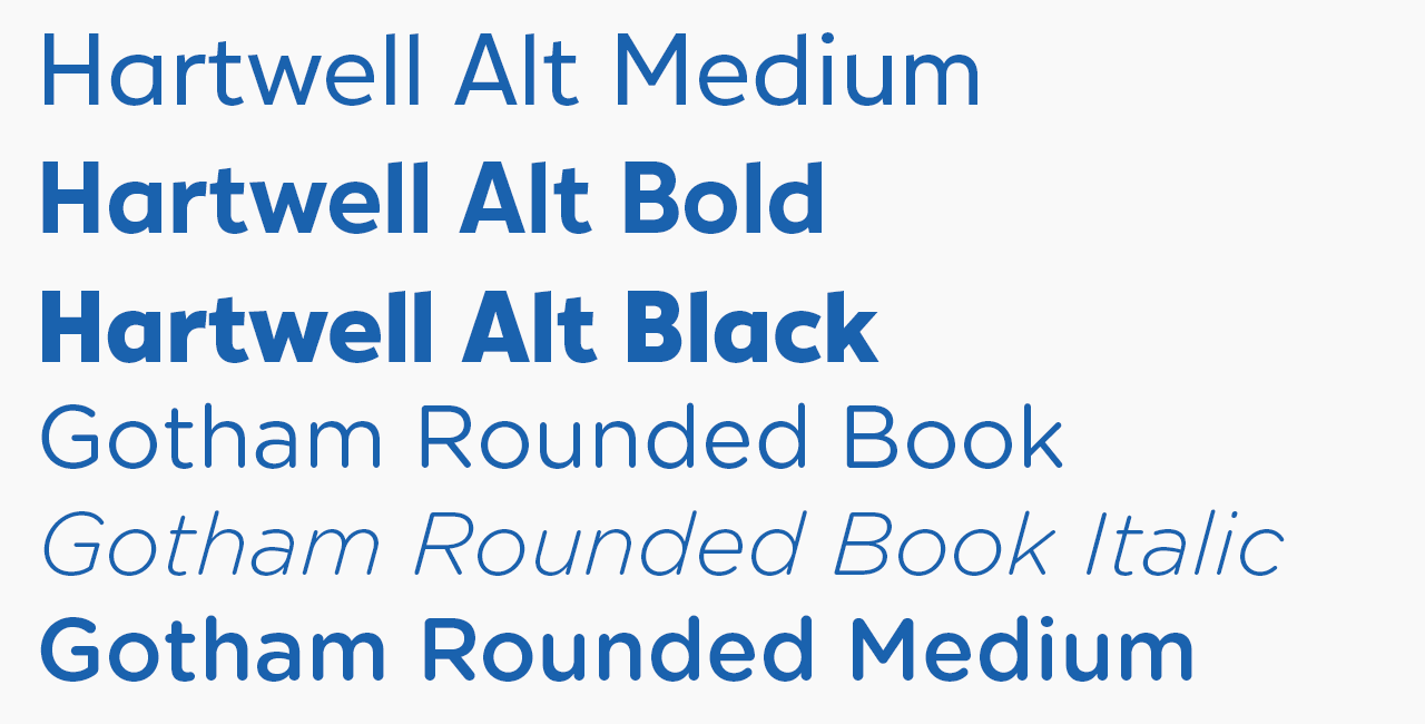
Hartwell Alt is available in 3 styles, Medium, Bold and Black.
Gotham Rounded is also available in 3 styles, Book, Medium and Italic
Usage
Headlines
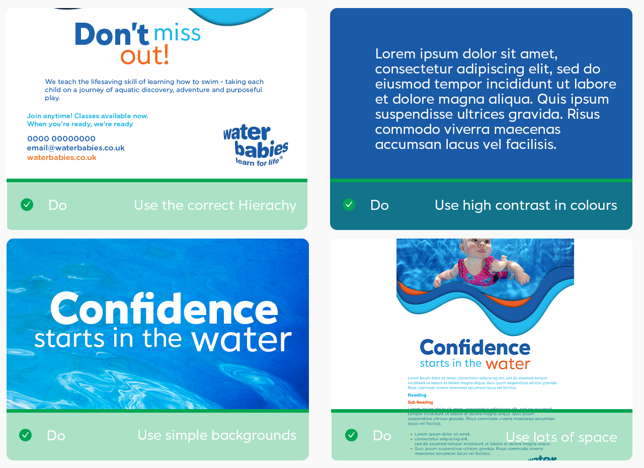
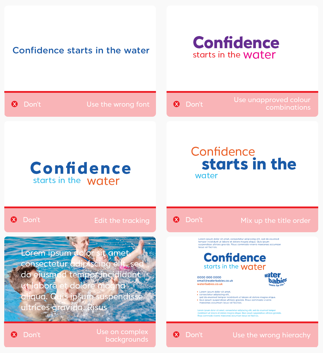
The majority of the time, our Headlines follow a 3 tiered system. We only use the Hartwell Alt font, but use it very differently to create maximum impact. We have 7 set Headlines which we use across the majority of our collateral, but this 3 Tiered system is also applicable to any other headline which needs to be used to produce our collateral.
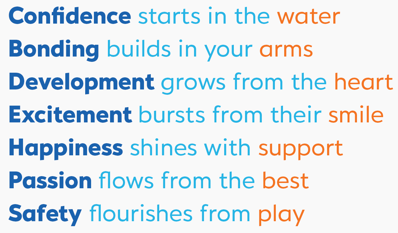
The first word is a catch word, attention grabbing for our audience. It is in the largest in size and stature. Hartwell Alt Black in blue. This word should take up the majority of the heading group.
The words sandwiched in the middle are the linking words, and are smallest in the headings. These are Hartwell Alt Medium, cyan and about 1/3 to 1/2 of the size of the first word.
The final word in our headings are slightly larger and differentiated in orange to help accentuate the message we are trying to convey.
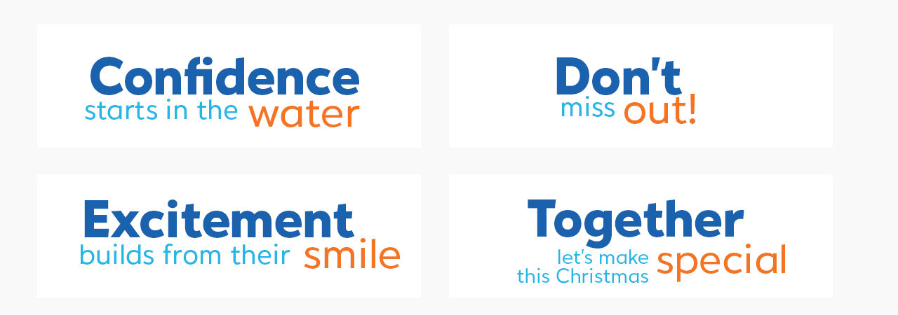
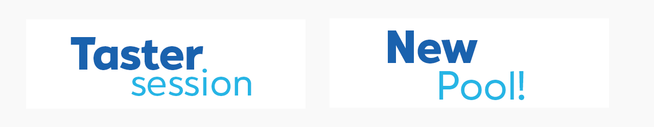
If titles are too short to use this tier system, we leave out the orange word at the end and make the cyan word(s) slightly larger.
For our titles on busier and darker backgrounds, we use the same 3 tier system for our headlines, but all colours are in white. We only place our titles on clear image backgrounds where the writing is coherent enough.
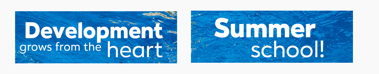
However, not all titles follow this exact pattern. For example, if the middle word(s) is more catching, the order can be slightly re-arranged, but the general structure remains the same.
Headings
18pt, Hartwell Alt Black, cyan/ blue
Subheadings
16pt, Hartwell Alt Black, orange
Main Body
12 pt, Gotham Rounded Book, blue
Quotes
12pt, Gotham Rounded Italic Book, cyan
Bullet Points
12pt , Gotham Rounded Book, blue. Circle bullets, orange.
Footers
7pt, Hartwell Alt, Blue
Contact Details
16 pt, Gotham Rounded, Blue, Medium, website always differentiated in Orange
All pt guidance is based on A4 Collateral. Size is reference to size of collateral being produced.
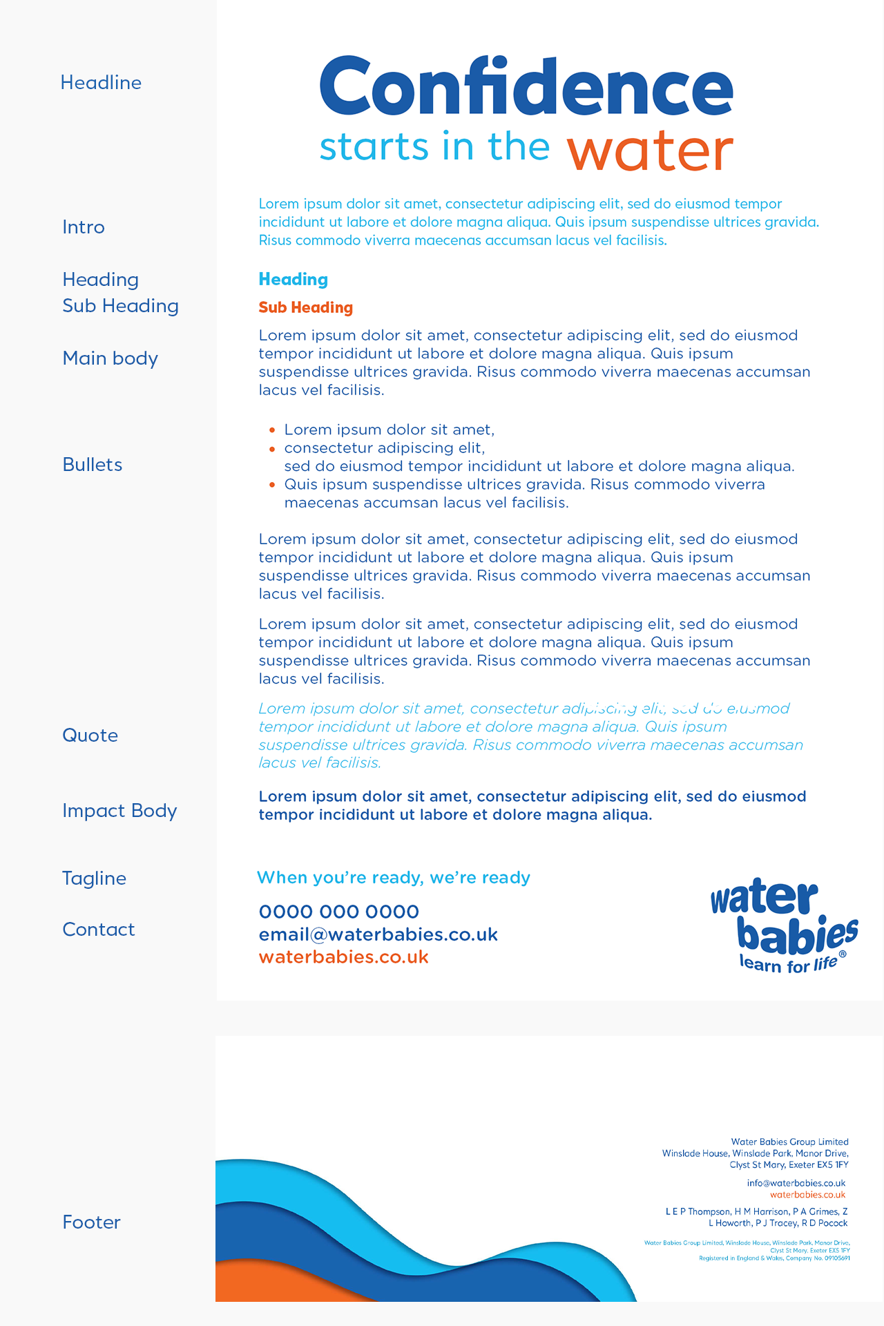
Hierarchy, Pairing and Guidelines:
We make our written communication coherent, and easy to understand with a clear, consistent hierarchy.
- Documents and collateral should always begin with the Headline.
- Intro text if needed
- Main body – can include: Bullet points, quotes, impact text
- Tagline
- Contact details/ Footer logo
Do’s and Don’ts:
If you have any questions or are unsure about anything, please email marketingsupport@waterbabies.co.uk and we will be happy to help.